Discover · smashingmagazine.com

Accordion Icons: Which Work Best?

Articles on Smashing Magazine smashingmagazine.com

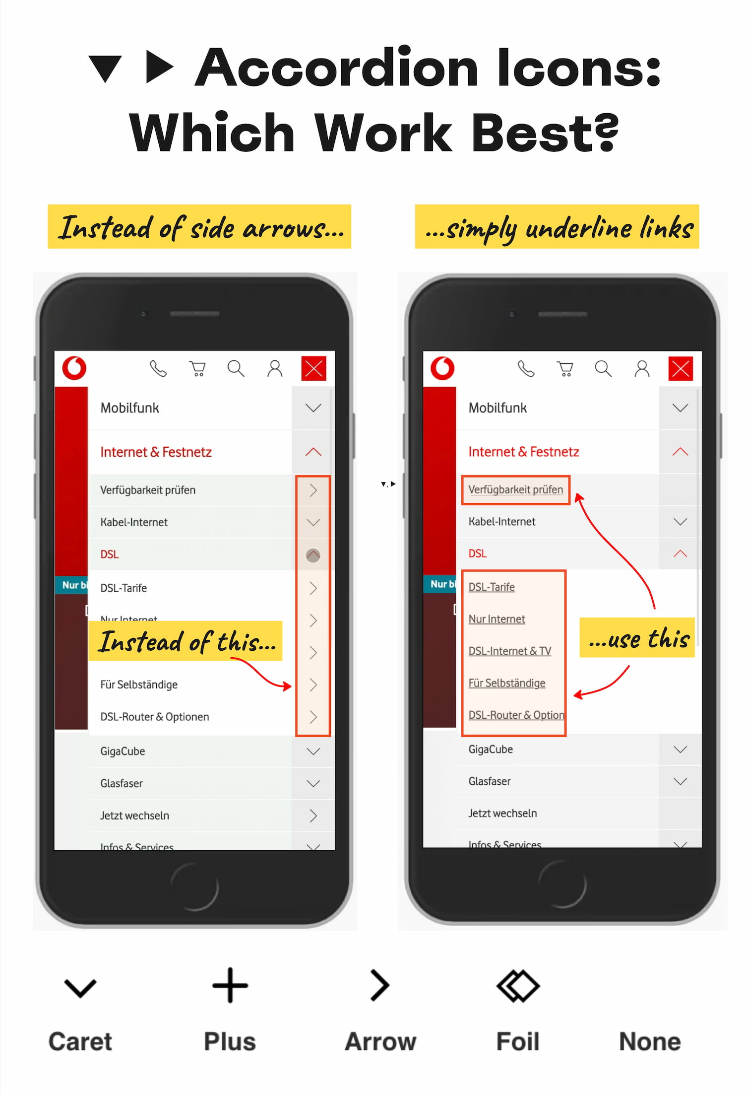
So what icon is the most reliable to show expansion and collapsing for accordions? Is there really any noticeable difference between carets, chevrons, arrows, and triangles?

Well, research shows that there is some difference indeed. But what’s more interesting is that split menus are harmful, why it's better to not have icons and text labels link to different actions, and why the caret is the safest icon choice. Let’s dive in!

More ways to use this
Open on another device
Scan this QR code to open the same public page

Scan to open this page. Your saved notes and account access are not included.

Download QR code

Open the page link

Named in it

Keep going

Each of these is read from what this estate already kept: the feed a piece came through, the publisher behind it, the credits and topics the publisher printed. None of it is a recommendation, an identity or a record kept anywhere else.

Also from Articles on Smashing Magazine

  1. Meet AI 2027 Conference (Dec 1)smashingmagazine.com
  2. AI Sped Up The Build: How Can Accessibility Testing Keep Up?smashingmagazine.com
  3. Should You Actually Add AI To That? A Four-Question Audit For Product Teamssmashingmagazine.com
  4. A New Community For In-House UX Peoplesmashingmagazine.com
  5. Making Immersive LLM Chat Experiences More Accessiblesmashingmagazine.com
  6. Modern CSS Might Make Your Front-End More Complexsmashingmagazine.com